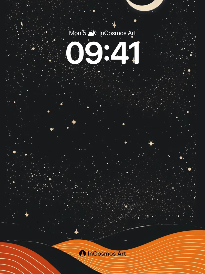
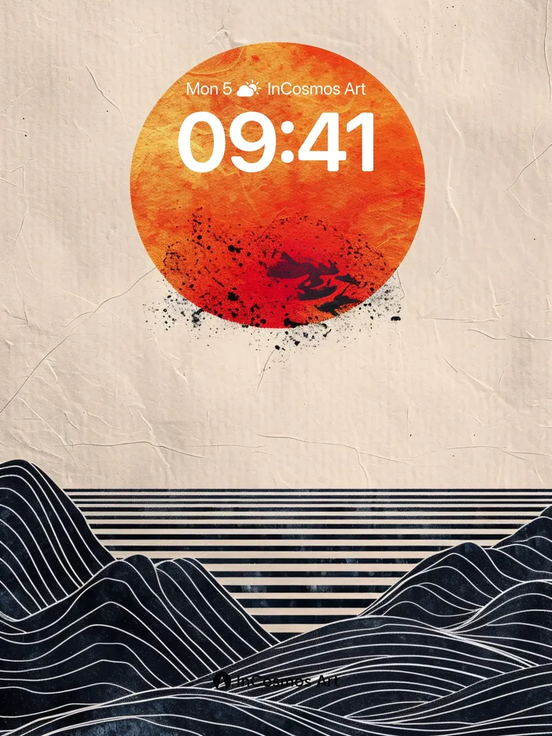
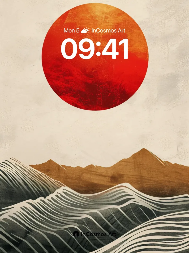
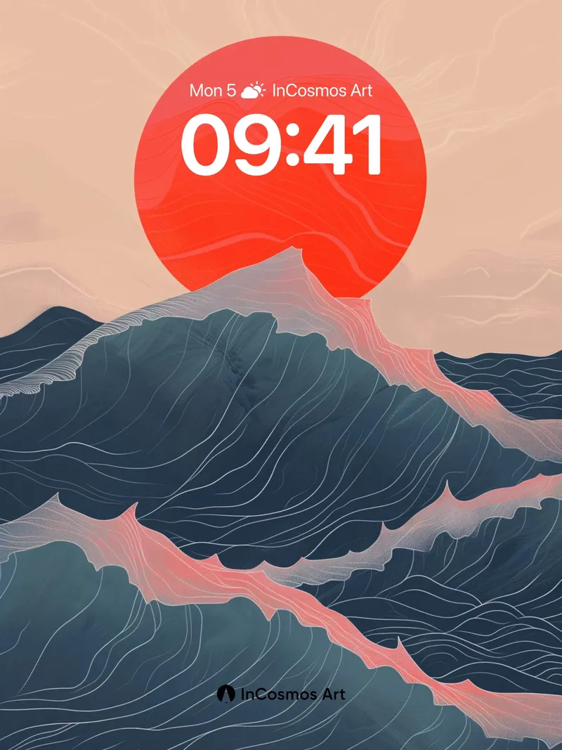
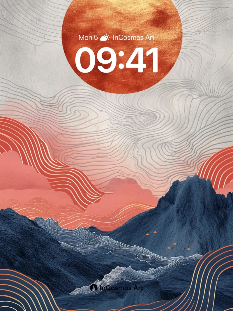
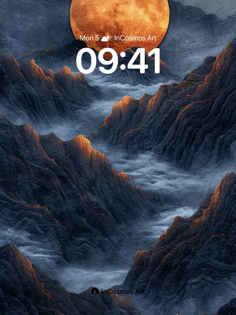
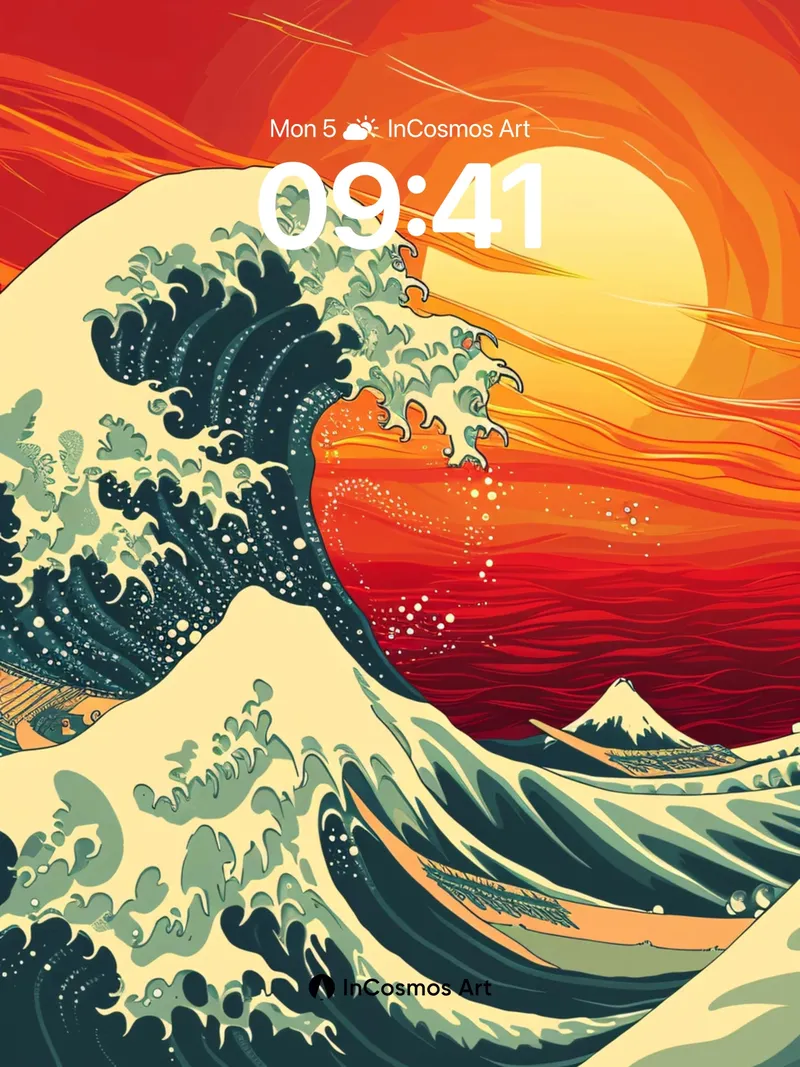
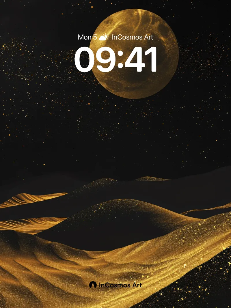
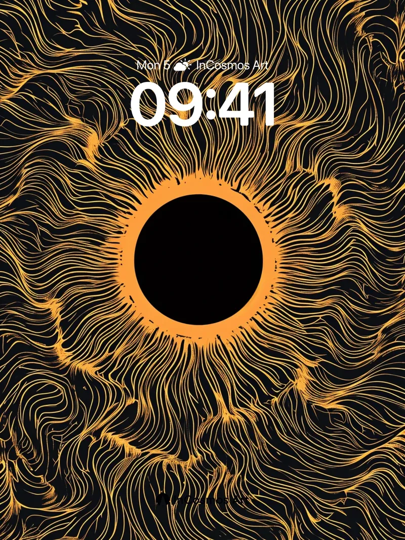
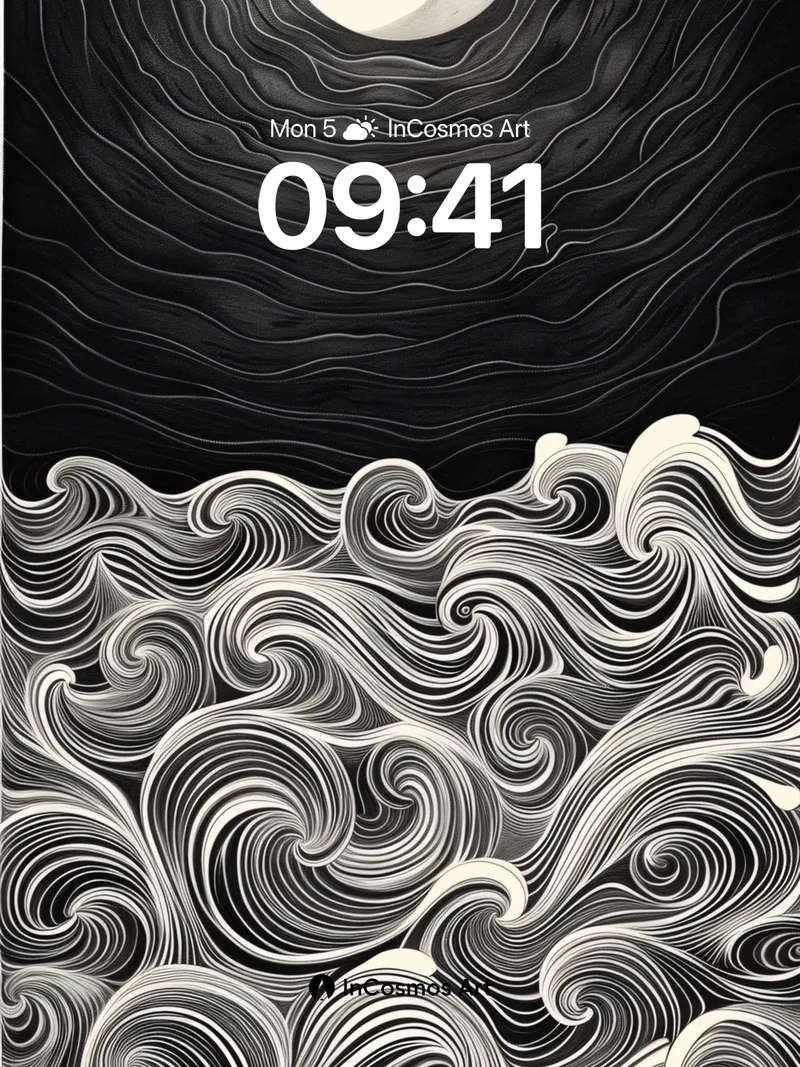
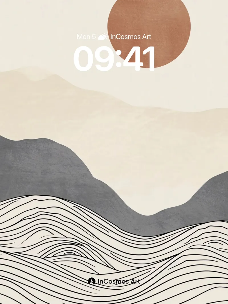
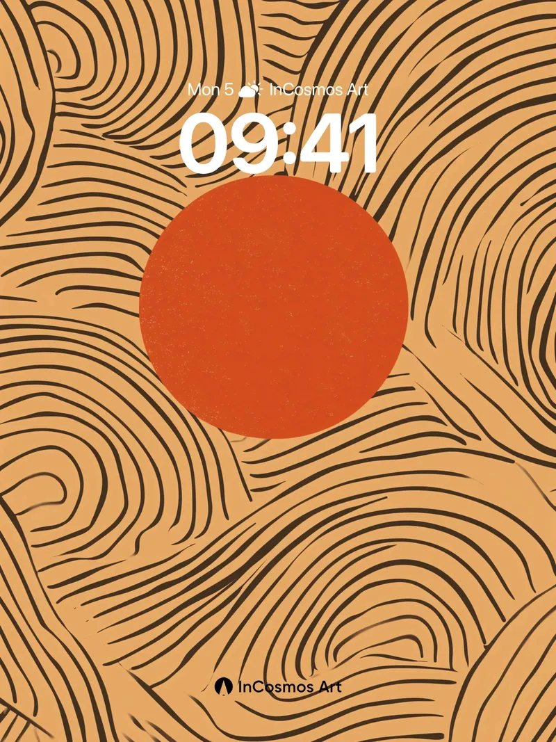
In contemporary design contexts, the combination of lines and circles is often seen as a form of minimalist expression. This approach does not rely on figurative content but conveys emotion through rhythm, proportion, and color. Behind seemingly simple shapes often lies the creator's reflection on space, order, and tension. The contrast between the fluctuation of lines and the stability of circles creates a visual balance, suggesting an internal emotional flow. This mode of expression is especially common in digital media, as it adapts easily to different sizes and backgrounds while maintaining strong recognizability.
Minimalism Is Not Emptiness
Minimalist style is often misunderstood as “less equals empty,” but in reality, minimalism is the result of highly refined distillation. Every line’s placement and every curve’s variation undergo repeated consideration. This restraint is not a lack of content but a high degree of control over content. In an age of information overload, minimalism becomes a way to resist noise.
The Circle as an Emotional Anchor
In visual language, the circle typically symbolizes completeness, stability, or cycles. When placed alongside dynamic lines, the circle acts as an anchor—even amidst surrounding change, the center remains constant. This structure provides a sense of psychological security and makes abstract forms more emotionally accessible.
The Rhythm of Lines
The density, direction, and curvature of lines determine the overall rhythm. Dense lines may evoke tension, while gentle curves create a relaxed atmosphere. Lines are not merely decorative; they function as emotional metronomes. In some works, lines even take on a narrative role, guiding the viewer’s gaze and simulating the passage of time or emotional shifts.
Color as Emotional Guide
Color often plays a supporting role in such designs but should not be overlooked. Warm tones enhance approachability, while cool tones reinforce distance. The same set of lines and circles can convey entirely different emotions under different color schemes. Color choices are never arbitrary but serve to establish the overall emotional tone.
Readability Within Abstraction
Although these works fall into the abstract category, their readability is not diminished. On the contrary, by removing specific imagery, viewers find it easier to project their own experiences onto the work. This openness gives the work greater adaptability and allows for diverse interpretations across cultural contexts.